
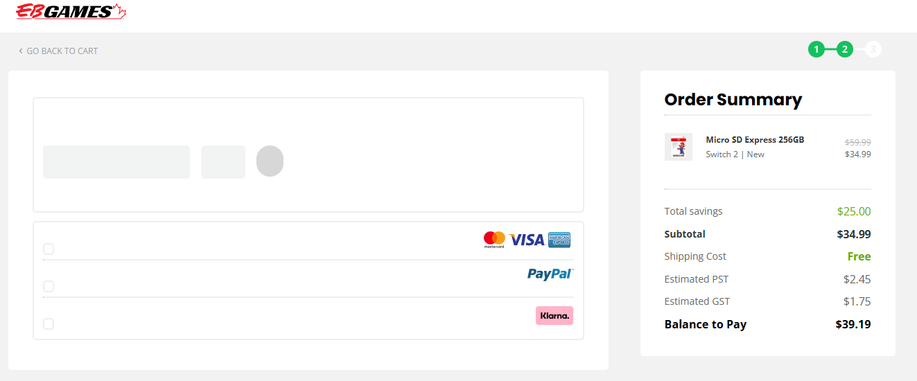
Usually when we visit a website we have a certain level of expectation in terms of how it should look just like if you were visiting a real store. If the page looks very plain with broken links then that usually implies it is potentially an unsecure place to shop at. With that in mind, this was an interesting example as the company Gamestop was having a pretty decent sale for some Micro SD Express cards and I decided to get one. When I added it to the cart and went to the payment page everything looked plain as if the site didn’t load up.
I thought it was a browser issue but the same issue persisted. However, upon closer inspection you can see the check boxes on the page where it just blends in with the page color in general. When you click on it then allows you to proceed. I was actually going to just leave and not bother to make the purchase thinking the site was just broken.
But I suppose that’s a great example on how presentation and appearance of an online store matters just like a traditional retail store. Imagine how many times the company did lose a sale because of that type of oversight.